Contrast in Interior Design: Simple Ways to Add Focus and Depth
- Jul 8, 2025
- 3 min read
Updated: Sep 27, 2025
Want to make your home feel more vibrant, structured, and intentional? The secret might be contrast. In interior design, contrast isn’t just about colors — it’s a powerful tool for guiding the eye, creating balance, and bringing depth to your space. This guide will show you how to use contrast like a designer — without overcomplicating things.

What Is Contrast in Interior Design?
Contrast is the use of opposing elements — like light and dark, smooth and rough, large and small — to create visual interest and structure. It draws attention, highlights focal points, and helps different areas of a room feel distinct and purposeful.
Types of Contrast Designers Use:
Color Contrast: light vs. dark, complementary colors
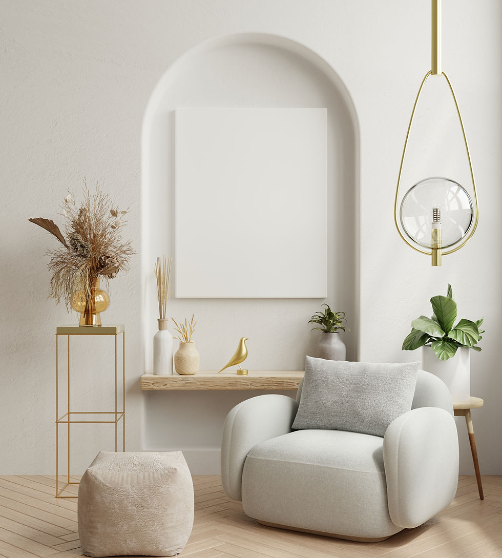
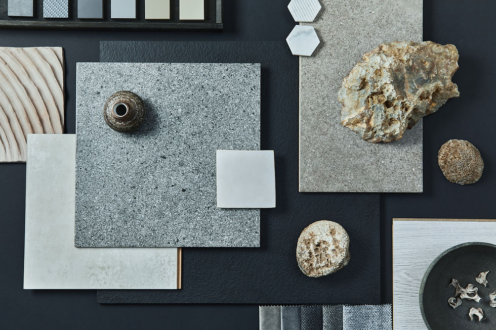
Texture Contrast: soft vs. rough, matte vs. glossy
Shape Contrast: curves vs. straight lines
Scale Contrast: oversized vs. delicate elements
Style Contrast: modern pieces in traditional settings (and vice versa)
When used right, contrast adds life to a room. When ignored, spaces tend to look flat or unfinished.
Why Contrast Matters
It Creates a Focal Point
Your eye needs somewhere to land. A dark painting on a white wall or a bold armchair in a neutral space immediately grabs attention.
It Adds Depth and Drama
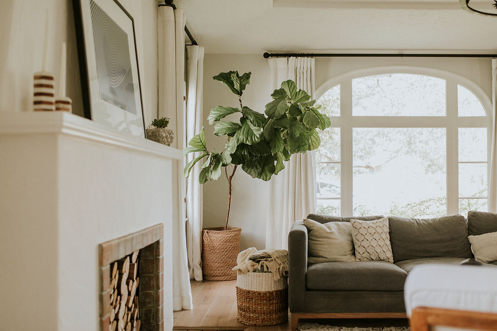
Without contrast, a room can feel monotonous. Think of a kitchen with only white cabinets and white countertops — now add a matte black faucet or a wood-tone island, and the space comes alive.
It Helps Define Zones
Use contrast to separate functions: a soft, light-colored bedroom corner vs. a deep-toned reading nook nearby.

How to Use Contrast in Interior Design (Without Overdoing It)
1. Start with One Type of Contrast per Room
If you're new to contrast, focus on a single type at a time — this keeps your design intentional and cohesive.
Color contrast: Create drama with opposites like navy + white, black + beige, or sage green + burnt orange. Example: a navy velvet sofa against crisp white walls.
Texture contrast: Combine rough and smooth surfaces — like linen bedding paired with a sleek leather bench or a boucle chair with a glass side table.
Shape contrast: Break up uniformity. If everything is angular, add curves with a round mirror or arched floor lamp.
Scale contrast: Use oversized art next to minimalist furniture or tiny decor on a chunky console — this creates hierarchy and flow.
2. Use the 80/20 Rule
Balance is everything. Use about 80% cohesive, calm elements (like neutral walls, natural textures, matching tones) and 20% high-contrast accents.
Think of 80% as your “canvas” — walls, flooring, big furniture
The remaining 20% should “pop” — accent chairs, light fixtures, pillows, artwork
3. Think in Opposites
Great contrast is often a dialogue between opposites. When designing a room, ask yourself:
Is everything smooth? → Add something rough or matte
Is everything light? → Introduce a dark tone
Is everything modern? → Add a vintage or handmade piece
Is everything soft? → Balance with metal, glass, or stone
These intentional shifts help break up monotony and add character.
4. Let Lighting Bring It to Life
Lighting is what makes contrast actually visible — so don’t skip this step.
Daylight: Enhances natural textures (wood grain, fabric weave)
Artificial light: Can flatten or intensify contrast — warm lighting softens edges, while cool lighting sharpens them
Test your contrast choices in both types of lighting before finalizing materials or colors.

Frequently Asked Questions
Can contrast work in small rooms?
Yes — it actually helps define small spaces. Just avoid using too many high-contrast elements at once. Focus on one bold accent and keep the rest simple.
Should all rooms in a home have contrast?
Not necessarily. Use contrast where you want to guide attention or add energy — like in living rooms, kitchens, or entryways. Bedrooms and bathrooms can be softer and more tonal.
I prefer minimalist interiors — is contrast still relevant?
Yes, and it’s actually essential. Minimalism without contrast often feels flat. Use material contrast (wood + stone), shape (clean lines + soft curves), or finish (matte + glossy) to add depth.
Can I create contrast using only neutral colors?
Absolutely. Contrast isn’t just about bright hues — think warm beige vs. cool gray, matte black vs. crisp white. You can also contrast texture, sheen, or shape within a neutral palette.
Final Thoughts
Designing with contrast doesn’t require expensive materials or big changes. With a few thoughtful pairings — color, texture, or shape — you can make your interiors more dynamic, balanced, and memorable.
Need Help?
Looking to bring more contrast and character to your home?
Tools and Hands offers expert handyman and remodeling services in Palatine, Arlington Heights, Barrington, Lake Zurich, and nearby suburbs. From accent walls to custom tilework — we’ll help your design stand out. Request a free estimate.