How to Combine Colors and Materials in Interior Design: A Designer’s Guide
- Jun 21, 2025
- 4 min read
Updated: Jun 27, 2025
Colors and materials aren’t just finishing touches — they’re the foundation of how a space feels. You might have a great layout or perfect lighting, but if the palette is off, the room won’t feel right.
Whether you’re renovating your home or planning your first remodel, here’s a designer-approved guide to combining colors and materials with confidence — even if you’re not a design expert.

1. Start with a Dominant Tone to Combine Colors and Materials Effectively
Every well-balanced room starts with one clear question: What mood do you want the space to create?
That mood is defined by your dominant tone — warm or cool — which sets the emotional temperature of the room.
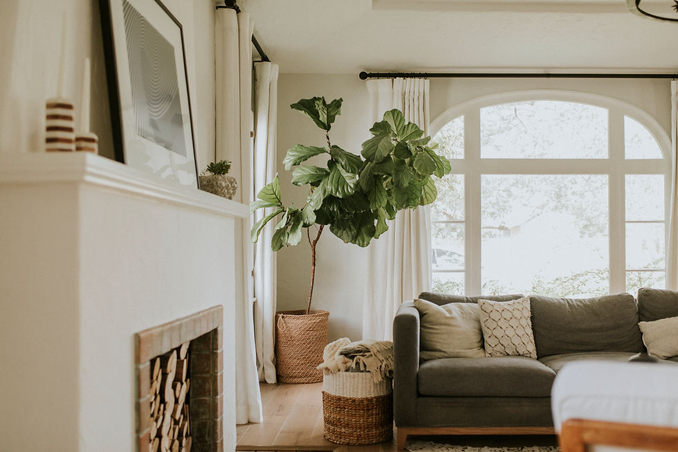
Warm tones like terracotta, beige, or caramel feel cozy and grounded
Cool tones like gray, soft sage, or light blue feel airy and calm
Once you choose a direction, build a clear hierarchy of colors:
Primary color — your base: walls, flooring, large furniture
Secondary color — supporting elements like rugs, curtains, or cabinets
Accent color — used sparingly for contrast: pillows, artwork, accessories
Pro tip: Stick to 3–4 key colors per room. This keeps the design cohesive and intentional — not busy or random.
2. Balance Hard and Soft Materials
Design isn’t just about how things look — it’s about how they feel. The best spaces have a mix of hard and soft surfaces that work together to create comfort and contrast.
Hard materials: wood, stone, glass, tile, metal
Soft materials: fabric, rugs, upholstery, curtains, plaster
Too many hard surfaces can make a room feel cold or harsh. Too many soft surfaces can feel mushy and undefined. The sweet spot is somewhere in between.
Example: If you install a polished marble fireplace, balance it with a textured rug, a boucle sofa, or soft linen drapes.
A good mix of textures invites touch and adds visual depth. It’s what turns a room from nice into memorable.

3. Let Natural Light Guide Your Palette
Light changes everything. The same paint color or material can look completely different depending on the direction and amount of natural light in the room.
North-facing rooms get cooler, dimmer light — warm tones can help balance it
South-facing rooms get warm, direct sun — cooler tones can create harmony
Always test your materials:
Don’t rely on tiny swatches or store lighting
Use large samples (12” x 12” minimum), taped to the wall or floor
Check them at different times of day and in different parts of the room
Designers never pick finishes under fluorescent lights. Real light, real space, real results.
Want to know what else to consider when choosing paint? Read our post: How to Choose the Right Interior Paint.
4. Mix Textures — But Keep One as the Anchor
Texture is what brings a space to life. It makes a neutral room feel rich and layered. But too many competing textures can feel chaotic.
The key is to choose one or two anchoring materials — something quiet and consistent — and then layer in more expressive textures around it.
Example combinations:
Matte stone flooring + linen curtains + aged brass hardware
Natural oak cabinetry + brushed metal + plastered walls
By giving the eye somewhere to rest, you allow other textures to stand out. Texture doesn’t mean loud — it means intentional contrast.
Texture is what keeps neutral interiors from feeling boring or flat.

5. Yes, You Can Mix Warm and Cool Materials — Here’s How
Many people believe they have to choose between warm tones (like oak or terracotta) and cool tones (like gray or chrome). But great interiors combine both — and that’s what makes them feel layered and natural.
The secret is simple: repeat each tone or finish at least two or three times throughout the room so it doesn’t feel like a random choice.
Example pairings:
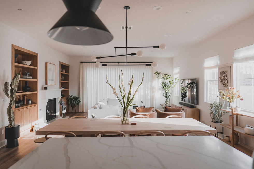
Cool gray walls + warm walnut furniture + walnut mirror frame
Charcoal tile + brushed gold fixtures + gold-framed artwork
Soft white walls + chrome lighting + terracotta pottery
Balance and repetition make mixed tones feel intentional — not accidental.
6. Combine Colors and Materials Using a Moodboard or Sample Board
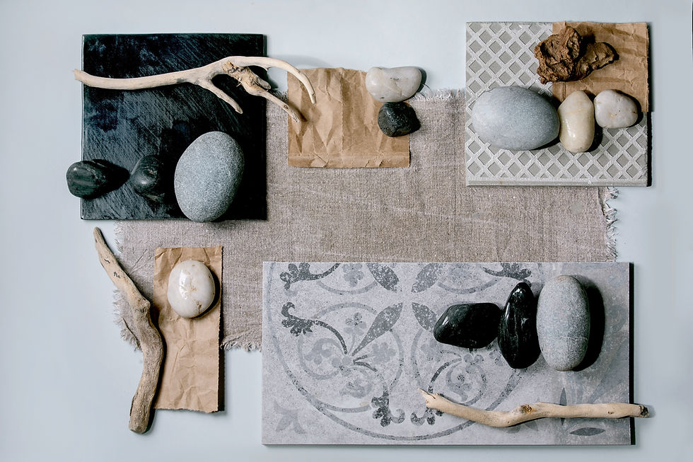
Trying to “see it all in your head” is risky — even for professionals. Instead, build a moodboard:
Collect physical samples of flooring, paint, tile, and fabric
Lay them out on a neutral background
Look at them together: Do they clash? Do they complement? Do they reflect the mood you want?
This is standard practice in every design studio — and it works just as well at your kitchen table.
What clashes on the board will clash in the room. Better to find out now, not after installation.

Final Thoughts from a Designer
Let your materials do the storytelling — marble says one thing, reclaimed wood says another
Use contrast intentionally: rough vs smooth, light vs dark, matte vs gloss
Don’t chase trends. Choose combinations that feel like you — and that you’ll still love five years from now
A well-designed room doesn’t just look beautiful — it feels calm, complete, and effortless.
Dreaming of a beautiful, well-finished space? We handle home renovations in Chicago and the northern suburbs — and we’re here to turn your design ideas into reality. Get a Free Estimate
