How to Choose the Right Colors for Your Home Interior: Color Theory Made Simple
- Jul 8, 2025
- 5 min read
Color is more than decoration — it’s an instrument. In interior design, color defines mood, creates balance, and influences how we experience space. Get it right, and your home feels cohesive and inspiring. Get it wrong, and even expensive furniture looks out of place.
This guide will walk you through the fundamentals of color theory, the practical tools designers use, and real-world tips for making your spaces look intentional and elevated.

What Is Color Theory — and Why Should You Care?
Color theory in interior design is the study of how colors interact and how we perceive them in space. It helps us answer questions like:
Why do some rooms feel calming and others overwhelming?
Why do beige-on-beige rooms sometimes look luxurious and other times cheap?
How do you choose colors that work together, not just look pretty on Pinterest?
At its core, color theory isn’t about rules — it’s about creating visual harmony.
Three Things You Need to Know About Color Before Making a Choice
Not all greens are created equal — and the same goes for any color. To choose the right shade for your space, you need to understand how colors behave.
Here are the three basic qualities of any color:
➤ Hue — This is the actual color family: red, blue, green, yellow, etc.
It tells you what general color you’re dealing with. “Navy” and “sky blue” are both shades of blue — that’s the hue.
➤ Saturation — How intense or muted the color looks
High saturation = bold, vibrant, eye-catching
Low saturation = soft, subtle, easier to live with
Think of the difference between a neon green jacket and a sage green sweater. Same hue — different saturation.
➤ Value — How light or dark the color is
For example, pale gray and charcoal are both gray, but one is much darker. That’s the difference in value.
Why it matters:
When you combine colors with different saturation and value, you create depth, balance, and contrast. Most interior designers avoid using ultra-bright, high-saturation colors on large surfaces — they’re too aggressive for everyday living. Instead, they use softer, layered tones that feel rich but not overwhelming.

How to Choose a Color Scheme That Actually Works in Any Room
Picking a bunch of pretty colors isn’t enough — they have to work together in a space. That’s where the color wheel helps.
The color wheel shows how colors relate to each other. Designers use it to build color schemes that feel balanced and intentional.
Here are four easy ways to use it:
Complementary Colors — Opposites attract
These colors sit directly across from each other on the wheel (like blue and orange or red and green).
Result: Strong contrast, high energy
Best for: small pops — throw pillows, artwork, flowers
Analogous Colors — Next-door neighbors
These are 2–3 colors that sit side by side (like green, teal, and blue).
Result: Calm, flowing, natural
Best for: bedrooms, bathrooms, reading nooks — places you want to feel relaxing
Triadic Colors — Three evenly spaced
Think of a triangle on the wheel: red, yellow, and blue.
Result: Dynamic but balanced
Best for: kids’ rooms, creative studios, or playful accents in neutral spaces
Monochromatic — One color, many shades
Pick a single color (like blue) and use it in different versions: light, medium, dark.
Result: Elegant, minimal, cohesive
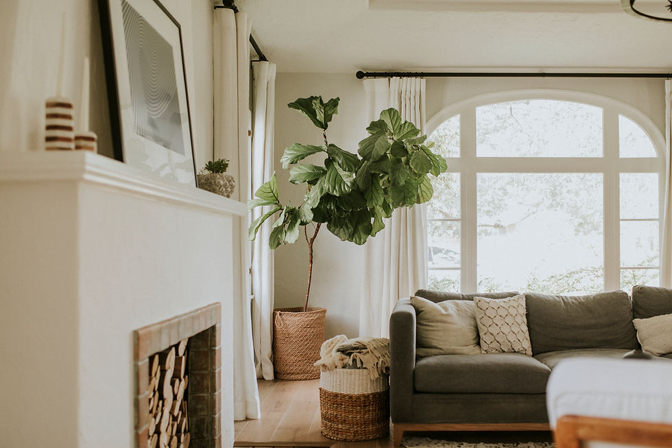
Best for: living rooms, kitchens, or when you want calm but stylish vibes
To keep it from looking flat, mix textures — matte walls + glossy tiles + soft fabrics.
Designer Tip: Start with 2–3 related tones (like soft beige, taupe, and warm white) as your base. Then bring in contrast using artwork, throw blankets, a statement light fixture, or bold chairs. That’s how you make the space feel pulled together — not thrown together.
Designer-Backed Color Palettes That Just Work
If you want your home to feel thoughtfully curated, try these ready-to-use combinations that feel unique yet livable:
Olive green + terracotta + cream — Earthy and grounded
Violet + ochre + cool gray — Artistic and moody
Forest green + antique brass + bone white — Classic and elegant
Charcoal + blush pink + walnut wood — Warm modern
Why they work: They balance warm and cool, dark and light, bold and soft. And unlike overused Pinterest trends, they still feel fresh.
Common Color Mistakes That Ruin Even Good Design
Color mistakes are surprisingly common. Watch out for these traps:
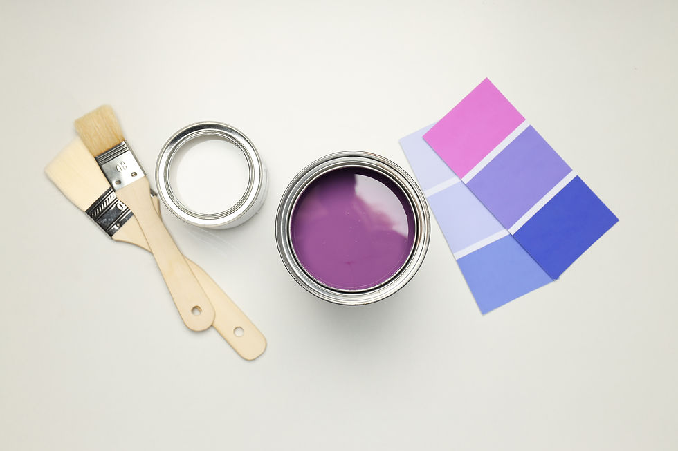
✖️ Ignoring lighting. Test paint in your actual space at different times of day. Natural light can shift color tones dramatically.
✖️ Too many strong colors. Without neutral anchors, bold colors compete and clash. Visual fatigue sets in.
✖️ Clashing undertones. Every color has warm or cool undertones. Gray with a blue base can fight with beige that leans pink. Always compare side by side.
✖️ No focal point. Without a visual anchor, the space feels chaotic. Let one piece lead (e.g., the sofa, art wall, or rug) and build color harmony around it.
How to Train Your Eye for Color: A Simple Practice Routine
You don’t need a design degree to see like a designer — just practice and a bit of structure.
Here’s a simple way to start noticing color combinations and making better choices:
Step-by-step color awareness exercise:
Pick one room in your home (start with the living room or bedroom).
Observe it at different times of day. Take photos in the morning, afternoon, and evening — and pay attention to how the colors change with the light.
✦ Does the beige wall look pink at sunset?
✦ Does your white trim look cold or warm?
Visit a paint store and grab color swatches. Don’t just look at them under store lights. Bring them home and hold them up against:
walls
sofa fabric
curtains
flooring
Use an online palette tool like Coolors.co. Upload a photo of your room and explore 2–3 new color combinations that could work with what you already have.
Ask yourself simple questions:
Which colors feel calm and balanced?
Which ones draw too much attention?
What should be the visual “hero” of the room?
Take notes (or screenshots). Keep a folder of your best combinations — you're building your own visual library.
With time, you’ll start noticing undertones, lighting shifts, and what makes a room feel “off” or “just right.” That’s how designers train their eye — and you can too.
Final Thoughts: Color Isn’t Guesswork — It’s a Tool You Can Master
Many people think color choices are about instinct or “good taste.” In reality, great interiors are built on clear logic, observation, and structure — not guessing.
When you understand the three basic properties of color (hue, saturation, and value), and how to use the color wheel to create relationships between tones, you're no longer just picking a “pretty blue.” You're building a system — a palette that works for the function and feeling of the room.